Posts

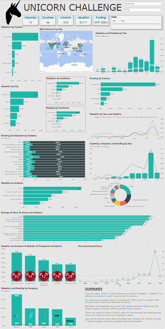
Unicorn Challenge

Image
  Unicorn Companies - Maven Analytics Challenge Unicorn Companies - Maven Analytics Challenge I am still in the early stages of making a career progression into data visualisation, but I decided I would take part in my second Maven Analytics monthly challenge.  Although I did not officially submit my entry (as I started after the submission date), I really liked the subject and decided I would use this data set to really focus on using Power-BI to push my creative abilities and to get more familiar with Power-BI. Until now, I had never added slicers, changed backgrounds, borders, text sizes, data titles, changed the canvas size etc... So this dashboard is quite an achievement for me. I prefer using power-BI, but being able to use both Tableau and Power-BI will be beneficial to my skill-set. QlikSense is also on my list to learn in more depth. My next Maven challenge will be incorporating more matrix features including KPI's. I would like to thank the great David Murray who helped

Airbnb Dashboard

Image
This is my brief attempt at experimenting with some sample Airbnb data from Maven Analytics that shows the most popular cities for Airbnb Listings and Reviews. I am only in the early stages of experimenting with Power-BI and creating dashboards... I feel I am gradually going in the right direction! Click on the dashboard for more detail
Image
World Cup Statistics 1930 - 2014 Here I have started to explore World Cup statistics - looking at how many host nations have won the World Cup between 1930 - 2014. There is no doubting Brazil have not only won the most World Cup tournaments, but have also scored the most goals too! There are nine teams that have both held the tournament in their own country and won... England being one of them in 1966!  
Image
This is my visualisation for a sample data set I used to show how industries have changed between 2011-2014 in Great Britain.  This is my first official visualisation after studying various courses since 2019.  What I noticed most about creating the dashboard is that the more I explored, the more questions came to light that needed to be answered. The drill-down of data can really develop a visual dashboard quite quickly. As my dashboards increase in quantity, I would obviously like to increase the standard of design and interaction - making it as visually appealing as possible, but making sure I choose the best type of graph for the data in question.  

Data-Dashboards Blog

 Hi! This blog will be where I upload my data dashboards and it is intended to highlight my development from complete beginner to a more advanced data technician! My background is in retail, graphic / textile design and bespoke artwork - but I am now transitioning my career towards data insights which I now realise is a very in demand skill that I have become very passionate about.  I feel the more I develop my skills and explore various data sets, the more questions are posed. And it is my job to display these findings in the most clear, exciting and decisive way possible. Expect, my dashboards to become more advanced as I progress! And I will post my personal development here too - which will highlight any work experience and courses that I undertake. Thank you for taking the time to share my journey into a new and exciting data career! Other blogs that I maintain that you might want to follow if you have a love of art & design: https://richardbakerart.blogspot.com http://richard